Maxim Kharchenko: LINCX, Ling, and Erlang.

If the phrase “line-rate packet processing from a software switch on commodity hardware” makes you raise an eyebrow, then you should watch this video.

This is Maxim Kharchenko, co-founder of Cloudozer and author of Erlang on Xen. He’s developed a piece of software called Ling, which tremendously improves the performance of the software defined switch LINC. For those in the know–like Infoblox CTO Stu Bailey (who conducted this interview)–it’s a huge development. They’re calling the project LINCX.

Stu commissioned me to shoot and edit this video for his keynote address to the 2014 Erlang User Conference in Stockholm. Software defined networking has been a topic of interest for him for quite some time. He’s recruited me to help him spread the word, both through Infoblox and FlowForwarding.org, an organization focused on enabling SDN on an industry-wide scale.

For those who aren’t involved in the networking industry: this is the longest video piece I’ve done to-date. I challenged myself to make this video engaging for someone not familiar with the material. If you’ve got the time, please watch–and leave comments if you’d like. I welcome feedback.

Ling Sketch

A sketch to help characterize Maxim’s software.

Building a Rhinoceros.

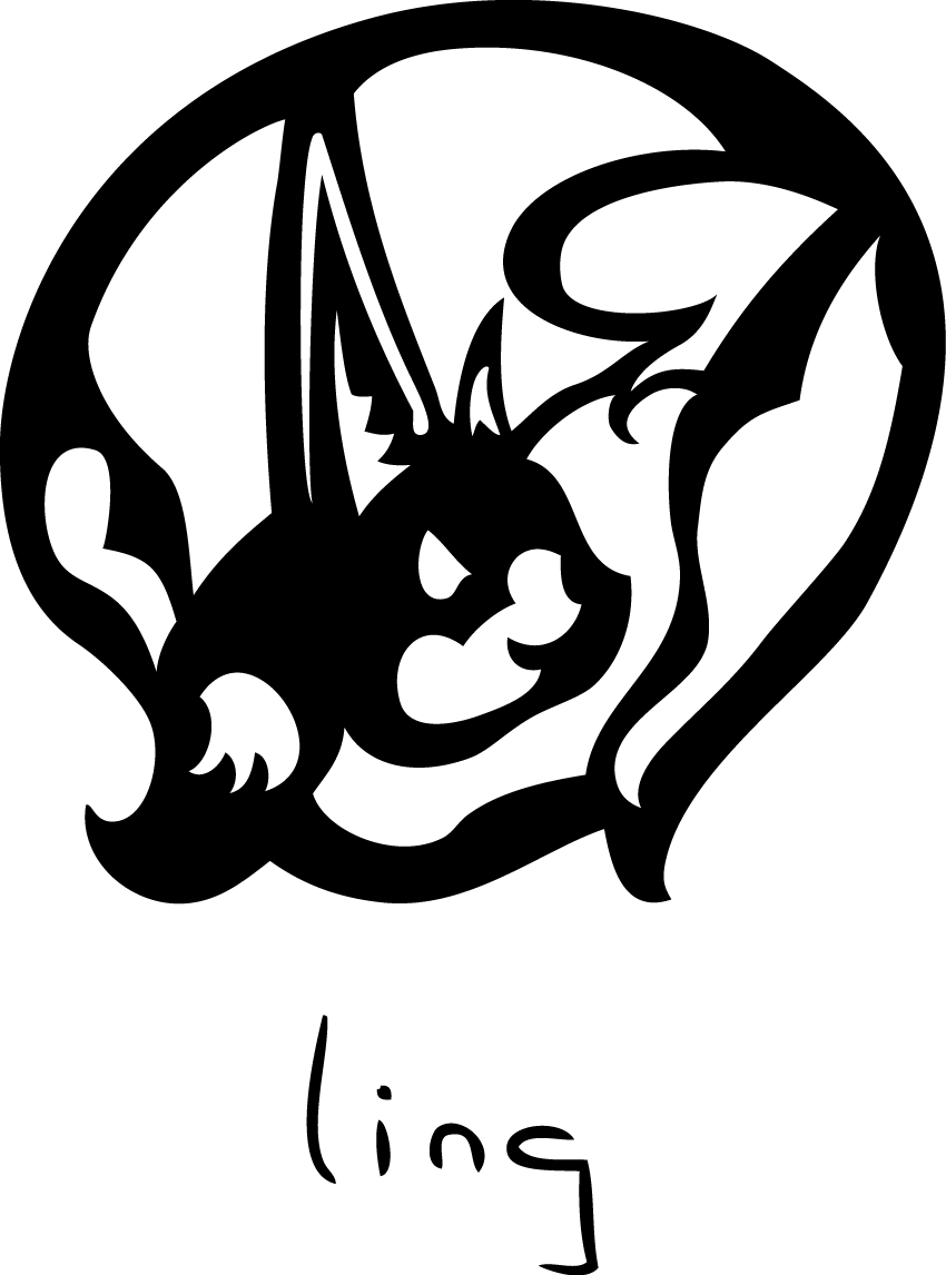
I’d like to introduce you all to the Flow Forwarding Rhino: coming soon to a network near you.

FF Rhino

Here it comes.

Flow Forwarding and the Rhino you see above you are just one small part of the software defined networking movement growing in the computer industry.

The Hardware Defined Network is an ecosystem that sells hardware — switches, routers, firewalls, load balancers, WAN optimizers. These products may have different names, but there’s no substantive difference in their underlying technology or function.

Stu Bailey

CTO, Infoblox

Read the full Wired Insights post.

Increasingly I find myself at the center of a network of very powerful computers: my phone, my iPad, laptop, desktop, etc.  All sorts of devices we own have some kind of microprocessor in them, busily tracking our virtual comings and goings, encouraging us to connect in some other way with the myriad of other networks out there. Even your average household appliance is now being equipped with computational power: this Samsung refrigerator, for example.

Samsung Fridge

This fridge will connect to Twitter.  It’s true.

You may not need your refrigerator to run apps at this point–but if you do, it’s available, because computer processing power is incredibly inexpensive.  Quite simply, it’s cheap to slap an Intel chip into any appliance.

The ready availability of such massive processing power was unfathomable when people first started imagining computer networks.  Most of the basic notions governing the way computers exchange information are, in fact, based on ideas developed for transmitting Morse code over telegraph wires. ((For an excellent explanation of this, I recommend the book Code: The Hidden Language of Computer Hardware and Software by Charles Petzold.)) Think about that; all of our amazingly powerful computers talk to one another via processes and protocols with their roots in the 19th Century.

Many people believe that this no longer need be the case.  Companies like VMWare have introduced us to the idea that any piece of computer hardware can be replicated by software. An increasing number of Silicon Valley insiders – like Infoblox CTO Stu Bailey – are saying that it’s time to apply that to networking.

For many, the idea that there is no difference between a router and a firewall is as ludicrous as thinking that there is no difference between a refrigerator and a stove. But, when it comes to computers, it’s true. I’m no computer scientist, so I will not be able to explain this in technical terms.  But let me see if I can explain it using kitchen appliances as an example.

Most of us have toasters.  Toasters are designed to do one thing only: make toast.  You could, perhaps, make toast many other ways in your kitchen, but because your toaster is inexpensive and efficient, you can afford to have it be an independent device.

Imagine for a moment that your toaster is easily capable of heating your entire home. And, if you know how to use it right, it can also cut your grass, clean your gutters, and make sushi. To complete this thought, now imagine that every appliance in your kitchen–stove, fridge, coffee maker–is an equally powerful and adaptable machine.

This is essentially what’s going on in networking today.  Giant companies sell multi-purpose machines, capable of computing feats that a mere 10 years ago seemed like science fiction, to other giant companies – and insist they are only able to make toast.  There are roomfuls of these machines in every corporation taking care of the drudgery of getting bits of information from one place to another.  Most of their potential remains untapped; and a good portion of the established computer industry wants it to stay that way.

Bailey–and others who think like him, including the Open Networking Foundation–are working to unleash this untapped potential.  The Flow Forwarding Rhino is part of this larger movement. And here, at last, is where design comes into play.  Remember the “Intel Inside” campaign?

Flow Forwarding is a little like that Intel chip within another company’s computer.  We branded FF specifically to show users and programmers that Flow Forwarding was powerful and reliable enough to be part of the larger networking landscape to come.

FF Rhino wall graphic

It’s got weight.

The FF Rhino is probably never going to appear anywhere on a product that your average consumer will buy–and that’s OK.  That’s really not its job. But we’ve invested the time and thought into making sure that the Rhino has the communication tools it needs to take it as far as it can go.  And, where computers are concerned, it seems that we are just getting started.

Another Version of The Resumé

I had occasion to assemble another version of my resumé today.  This one plays up some marketing/advertising campaign work and lightens up on the exhibition work.  I also included some live links in the PDF to some of the things I’ve written – for Production Plus’ eZine Solutions By Design, for instance.  I haven’t written anything for Pro Plus since we parted ways in 2008 or so, but there are some fun articles there in the archives, like this one where I get a quote from Smokin’ Joe Frazier) and my theater reviews for Centerstage.com.

I really enjoy the process of putting together a fresh resumé.  It gives me a chance to revisit old work, re-evaluate it, think about what I learned from it, and how I can apply that to my work today.  Take a look at this one if you’d like.  If you have any comments or suggestions, please send them my way!  I welcome sound opinions and dialogue on anything I’ve designed.

JD-resume-Apr2013


Chicago Cutlery – Restored.

knives03

A set of handles standing upright within a grubby box of kitchen implements caught my eye while poking about a garage sale one day.

Some of the knives were scattered at the bottom of the box; and everything, including the block, was covered in a generous layer of old grease.  But it was indeed a set of Chicago Cutlery.  Many of the blades were poorly cared for, and some showed signs of active misuse.

But hell, they were One American Dollar™ for the whole set!  I scampered off with them and headed over to the local hardware store.  I don’t know a hell of a lot about knives, but I’ve always wanted to learn more; this seemed like a great opportunity.

The guy at the hardware store was impressed.  He pointed out that the rivets on the knives were brass.  “They stopped making these outta brass in like 1983,” he confided, “so these are great knives, from back when they just sold to butchers.”

I’m not sure he’s right about the latter factoid, but I like the sound of the brass rivets part.  And the timeline matches up well with the style of the logo:

Chicago Cutlery Logo

Honestly, how much more 1980 can you get? I can practically hear Steely Dan playing in the background.

That typeface? The woodburn? It doesn’t take a lot of graphic design research to smell 1979 on that one.

I left the hardware store with the assurance that I had indeed found a badass set of knives, and a bagful of new tools:

  • some steel wool (#00 grade)
  • lemon oil, to restore the handles
  • a whetstone
  • honing solution, to put on the whetstone
  • mineral oil, to restore and polish the blades.

Add to that some fine sandpaper of my own that I already had (220 grit, I think), and I was off to Elbow Grease Alley to sharpen up my new set of knives.

3 hours later:

knives02 knives01The wood turned out really nicely and feels solid in your hand.  And the knives are, for the most part, absolutely deadly sharp.  They cut tomatoes in razor thin slices.

Chicago Cutlery 61S photo

The 61S, kicking ass during my lunch today.

I’d love to learn more about these knives and how to use them.

  • What specific cut is each knife designed for?  What do the designations (61S and so forth) mean?
  • As y’all can see from the photo above, Knife 62S (the second from the bottom in the top photo) is blunted.  The tip was bent when I bought it, and it snapped off while I was trying to straighten it.  It is by far the dullest of the knives, virtually unusable.  I’m just starting to learn how to sharpen knives properly, and I haven’t been able to get this one sharp at all.  It’s beyond my capabilities at this point.  Any suggestions?
  • I’ve done absolutely zero research on Chicago Cutlery as a brand, but it would be fun to do a little logo research; figure out what typeface that is, where it came from, who designed it, etc.

The whole project took about 4 hours (trip to the hardware store included), and, hopefully, will lead to some more interesting learning about cooking, brand design, etc.  I’m looking forward to seeing what opens up.

Unleashed Reaches Chicago!

I’m driving southbound on Broadway on the north side of Chicago this afternoon when a familiar logo blazes by on my left.

UnleashedBroadway-Facade01Unleashed has made it to Chicago!  Find the store here!

I’ll be going back to take some more photos; the ones I took don’t do it justice.  I’m so pleased with the way it was deployed; it really feels warm and inviting in there, which is just the way Mike Lewis imagined it.

More to come! Meantime, check out my photos of the original Unleashed here.

Unleashed: by PETCO

This is Unleashed by PETCO, a store I designed for PETCO in 2009. One of the things I most appreciate about it is how fully realized it is. Nearly everything that Mike Lewis and I came up with was built and installed; we got the chance to reexamine every aspect of the retail experience and develop something that we both thought would really be a more friendly, pet-centric environment.

A Bit on 50’s Typefaces.

Like many graphic designers, I really enjoy learning about fonts and typefaces.  I frequently lose myself looking up typefaces on the web, whether for a project or out of personal curiosity.  Typefaces, for me, are evocative of … particular times, places, events, objects, any combination these at once.  I find choice of typeface to be meaningful, so much so that I cannot help but be particular about a certain capital B and how perfect it is for the project I’m working on, and so forth.

A project I’ve been tossing about lately has been aching for the certain panache a solid font from post-WWII 1940’s and 50’s gives: a Futura of some kind, or Alternate Gothic, even.

Alternate Gothic

Ain’t it great looking? Thanks to the folks at The League of Moveable Type blog for this image and their hip blogpost on Revival Typefaces.

Great fonts, no doubt, but not quite grabbing the look I wanted.

So I started to look around for references for what authentic 50’s typefaces were–for things like roadsigns; headlines in the New York Daily News, or the Post; dire warnings of atomic doom like fallout shelter signs, and the like.  And I found a few great things that really helped sum up what I was looking for, and I thought I’d record it here so I would know how to find my way back to it.  And, perhaps, other people will find these links useful as well.

The first item of note is this quote from Mark Simonson in a blog called Typophile, way back in 2005: “… Venus (especially Venus Extended), News Gothic/Trade Gothic, Alternate Gothic, Century Schoolbook, Century Expanded, Baskerville, Caslon 540, Stymie, Futura Display, Bauer Topic, Onyx, Brush Script, Latin, Playbill, Balloon, Flash Script…”

Some, of course, I was very familiar with, but I had never even heard of a font named Bauer Topic before!  Or Venus!  I’ll never miss an opportunity to learn about a seminal 50’s typeface; off into the internet I went, and came back the richer for it.

After I returned from that excursion, I read further down the Typophile blog conversation and found this entry, from Norbert Florendo, which I’ll quote at length:

… If we were to divide “American advertising” of the mid-nineteen-fifties, you would have high design style such as Bradbury Thompson, a huge mid-range and off course, (sic) schlock.

Handlettering was prevalent in use before the 50s because offset photo-lithography became the common and inexpensive means of printing and therefore affordable to most advertisers. By 1955, New York City became the mecca of lettering artists with an estimated 300 professionals employed. (Please read Peter Bain’s great article on phototype.)

Photolettering, Inc. (PLINC) in New York, was quickly building one of the largest libraries of phototype, with a stable of fledgling and veteran lettering artist such as Vinny Pacella, Vic Caruso and Ephram Benguiat.

Beautiful scripts and brush lettering abounded, and a popular treatment during the 50s was “Frisky” headlines (bouncing and rotated baselines).

Also, after Sputnik, the “Space Age” style became popular as well.
Believe it or not, Myfonts.com has a category of 1950s type suggestions.

I found all this to be a tremendously helpful starting point. I always find it useful in any project to know the history behind the typefaces I’m using, particularly if I’m going for a look and feel that hearkens back to a certain idea.  Simply knowing that Helvetica wasn’t around until 1957–and what sans serif fonts preceded it–has informed all sorts of my choices when working with type in any setting.  Mr. Florendo’s entry above is chock full of great starting points for all sorts of interesting learning about graphic design and typesetting from that era.  My reasons for quoting it so completely above are somewhat selfish; I’ll be coming back to this to look up some of the names and references when I have the time.

Mythbusters: The Explosive Exhibition

I had the great fortune to work on the team that developed, designed, and made Mythbusters: The Explosive Exhibition. Here are a few shots of my graphics from the debut at the Museum of Science and Industry in Chicago!