I had occasion to assemble another version of my resumé today. This one plays up some marketing/advertising campaign work and lightens up on the exhibition work. I also included some live links in the PDF to some of the things I’ve written – for Production Plus’ eZine Solutions By Design, for instance. I haven’t written anything for Pro Plus since we parted ways in 2008 or so, but there are some fun articles there in the archives, like this one where I get a quote from Smokin’ Joe Frazier) and my theater reviews for Centerstage.com.
I really enjoy the process of putting together a fresh resumé. It gives me a chance to revisit old work, re-evaluate it, think about what I learned from it, and how I can apply that to my work today. Take a look at this one if you’d like. If you have any comments or suggestions, please send them my way! I welcome sound opinions and dialogue on anything I’ve designed.
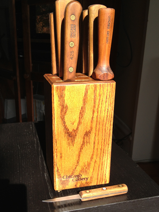
Some of the knives were scattered at the bottom of the box; and everything, including the block, was covered in a generous layer of old grease. But it was indeed a set of Chicago Cutlery. Many of the blades were poorly cared for, and some showed signs of active misuse.
But hell, they were One American Dollar™ for the whole set! I scampered off with them and headed over to the local hardware store. I don’t know a hell of a lot about knives, but I’ve always wanted to learn more; this seemed like a great opportunity.
The guy at the hardware store was impressed. He pointed out that the rivets on the knives were brass. “They stopped making these outta brass in like 1983,” he confided, “so these are great knives, from back when they just sold to butchers.”
I’m not sure he’s right about the latter factoid, but I like the sound of the brass rivets part. And the timeline matches up well with the style of the logo:
Honestly, how much more 1980 can you get? I can practically hear Steely Dan playing in the background.
That typeface? The woodburn? It doesn’t take a lot of graphic design research to smell 1979 on that one.
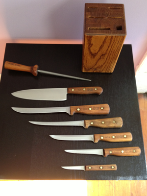
I left the hardware store with the assurance that I had indeed found a badass set of knives, and a bagful of new tools:
some steel wool (#00 grade)
lemon oil, to restore the handles
a whetstone
honing solution, to put on the whetstone
mineral oil, to restore and polish the blades.
Add to that some fine sandpaper of my own that I already had (220 grit, I think), and I was off to Elbow Grease Alley to sharpen up my new set of knives.
3 hours later:
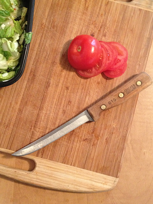
The wood turned out really nicely and feels solid in your hand. And the knives are, for the most part, absolutely deadly sharp. They cut tomatoes in razor thin slices.
The 61S, kicking ass during my lunch today.
I’d love to learn more about these knives and how to use them.
What specific cut is each knife designed for? What do the designations (61S and so forth) mean?
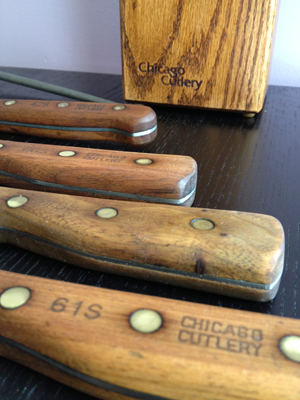
As y’all can see from the photo above, Knife 62S (the second from the bottom in the top photo) is blunted. The tip was bent when I bought it, and it snapped off while I was trying to straighten it. It is by far the dullest of the knives, virtually unusable. I’m just starting to learn how to sharpen knives properly, and I haven’t been able to get this one sharp at all. It’s beyond my capabilities at this point. Any suggestions?
I’ve done absolutely zero research on Chicago Cutlery as a brand, but it would be fun to do a little logo research; figure out what typeface that is, where it came from, who designed it, etc.
The whole project took about 4 hours (trip to the hardware store included), and, hopefully, will lead to some more interesting learning about cooking, brand design, etc. I’m looking forward to seeing what opens up.
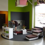
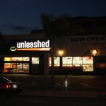
I’ll be going back to take some more photos; the ones I took don’t do it justice. I’m so pleased with the way it was deployed; it really feels warm and inviting in there, which is just the way Mike Lewis imagined it.
More to come! Meantime, check out my photos of the original Unleashed here.
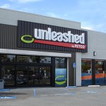
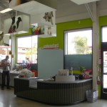
This is Unleashed by PETCO, a store I designed for PETCO in 2009. One of the things I most appreciate about it is how fully realized it is. Nearly everything that Mike Lewis and I came up with was built and installed; we got the chance to reexamine every aspect of the retail experience and develop something that we both thought would really be a more friendly, pet-centric environment.
Unleashed by PETCO; the flagship store in the Hillcrest neighborhood of San Diego
One of the fundamentals of Mike’s vision for this store was the idea that it would be friendly to customers and their pets – even inviting. Following his lead, we designed a community center into the store. Intended for pets and pet parents, this included custom benches and water fountains for both, healthy plants, and a reference library. He was looking to develop a community around each store; a resource center for people looking for nutritional information, activities, friends, and all things pet-related.
We went through a lot of iterations of this storefront. Like most of the process, we were designing for both concept approval and the construction crew! Everything I was designing had to be able to be built: and immediately. We had less than 4 months to open the store. Immediately upon approval of a concept piece, I would turn the Vectorworks files into build drawings and send them off to an architect/construction firm for translation into construction plans. And all this was done from Chicago! I hadn’t even seen the storefront in person.
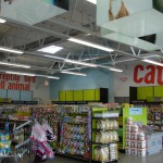
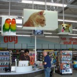
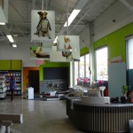
We wanted the areas of the store to be unmistakably identified from the moment you walked into the store. That, to me, meant giant letters on the walls indicating where each area could be found. Once the customer made it to the general area, then eye-level signage could take over. The store, being about 5000 square feet, was not overwhelmingly big – but we wanted to make sure that the layout and navigation within in was crystal clear and effortless.
One of the most fun parts of this project was designing the light fixtures. We combed through endless images from Shutterstock and Getty to get the right animals to represent the store; the right balance of dogs, cats, and other animals; images that we thought most upheld the brand attributes of Unleashed.
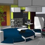
We were greatly fortunate to have the freedom to examine every design decision down to minute details. This is a good example of one of our working drawings; the community center, as it was coming together. As you can see, most of this got built to our specification, though the coffee table still had some revising to go through. That really was a cool coffee table; I’d love to have someone take that design and build it for us. Any takers?
Hello, Internet users! John Dalton here. I’m a designer – mostly of museum exhibitions. I’ve been designing things for 20 years solid.
Like many who pursue labors of love I’ve had to support myself while so doing, and in my early days compiled what one might describe as a stunning menagerie of jobs. I’ve designed packaging to deliberately look cheap. I’ve painted an 8′ x 8′ theatrical drop in a 6′ x 6′ room. I once had an employer demand I print a slew of large-scale digital images out of a giant photographic printer that was not assembled yet. “We’ve got jobs due out of that thing,” he said, tight lipped and pointing at the printer and the team of German technicians congregated to assemble it. “Get to work.”
I’ve hung EarthBall™ sized Christmas decorations from the ceiling of the Woodfield Mall with Bill Cusack. True story.
Slowly – over time, and amidst setbacks- this thundering herd of weird gained some shape. Cool projects began to emerge from it; museum exhibitions, photo galleries, plays, movies, graphics, art installations, marketing campaigns, retail design.
This evolution continues. I’ve begun doing theatrical reviews, of all things. I’m developing an understanding of creative direction, and finding opportunities to step into that role. Hopefully you get the idea. It’s been an eclectic, meandering evolution, catch-as-catch-can at times.
I’ve found it challenging to encapsulate all this in one website. It’s a task I’ve long been dreading. Predictably, I’ve always wanted my website to be tremendously cool. As a longtime aficionado of teh internets, I have seen many a cool website. It’s daunting. Call yourself a designer on the internet and immediately you’re in direct competition with Saatchi & Saatchi. My last website was built in Dreamweaver, circa 2002; my internet manipulation skills were lackluster even then.
But I do consider myself to be a thoughtful designer, and over time I’ve developed a little toolkit of ideas to help me through thorny spots like this. And I recalled something I read in Bruce Mau’s Incomplete Manifesto For Growth; the quote from John Cage at the top of this missive: begin anywhere.
Cage’s continues (quote helpfully provided by Mr. Mau), saying that “…not knowing where to begin is a common form of paralysis.” Most accurate. I’ve not known how to begin this insurmountable task and it’s kept me paralyzed.
On the recommendation of John Cage and the urging of Bruce Mau, I’m starting now. I will slowly build this thing. Get my hands dirty and learn from the process, without really knowing what to expect. I look forward to learning, and I’ll share my findings; optimally you’ll see the results here. In addition, I’ll be posting portfolio pieces, observations, essays – whatever seems to be applicable to this labor of love, my career.
Serendipitously, Bruce Mau has chosen this maxim as his principal image for his manifesto page. It’s nice when things like that come together, ain’t it? It seems an obvious sign. Many thanks to Mr. Mau for his inspiration and example.
Sometimes clues are in very obvious places. I’ve learned a lot from his work, and I hope someday to meet him.
This is my website. There are many like it, but this one is mine. Thanks for tuning in – or retuning, if you caught my last spate of blogging. I hope to repost those here someday soon. Mostly, though, I’m looking forward to where this leads. Please feel free to chime in, if you’d like. And welcome aboard.
I love this ad campaign. A simple idea, well executed. I ask a deceptively simple question: why is it so good?
Dentyne’s Make Face Time Campaign, by McCann Worldwide
Designers are key players in the world of advertising. It’s where many of us make all our money. The giants of our field all won major battles in that arena: Paul Rand, Saul Bass, Tibor Kalman, to name a few. Though I would not presume to place myself in such august company, I have worked for commercial firms and wrestled with advertising work, branding, and experience design in a corporate setting. I’d love to say that I could come up with something as good as McCann’s “Face Time” campaign. But how would I do it?
My design approach is, traditionally, to let the content speak for itself. If I understand the material, then communicating it to an audience through whatever medium I’m working in becomes almost a transparent process; the job sometimes feels like it’s flowing out of me. But frequently in the corporate advertising world, there is no content, in the traditional sense. There is no script, as in theater or film; there are no curators, filling volumes with text about artifacts or ideas. There is only the product, and the company that makes it. Frequently, the folks from the company are looking to the design world to define and shape the substance of the experience. They understand who their target audience is, and all about their brand and product, but look to designers to craft the messages.
It’s not a step I’m accustomed to. I understand, at an elementary level, the message is that the product/service is the best and people should purchase it. But ads with copy like, “WE ARE AWESOME,” or “BUY OUR STUFF BECAUSE IT’S THE BEST EVER” really do not make it to the public eye anymore. Clients expect more from someone who claims to be a hotshot designer–and rightly so. Advertising is a competitive and subtle world; there are wonderful ad campaigns and brand experiences out there. I know them when I see them, and I admire the specificity of the message. So where does that message come from?
In my readings and research, I recently came across this quote.
The new medium of brand experience is now people, not television.
– David Dernie, In Exhibition Design
In one phrase, David Dernie both encapsulated and completed my unformed thoughts about what it means to, as the oft touted phrase goes, “build a brand experience.” For me, it goes beyond television, though it certainly applies. The thing I respond to in ad in any medium is how the people in them feel. The more specific the ad hones in on that feeling, the more effective it is.
Consider this commercial, long considered to be a watershed in the world of automobile advertising:
(For more about this ad, and the Nick Drake book that talks about it, see John’s comment below.)
The ad speaks volumes, and not just because of Nick Drake’s marvelous “Pink Moon.” The ad is incredibly specific about the product and the people who use it. The look the young man in the back seat gives the young woman as she silently watches the night sky fly by, wind in her hair; the flash of the backup light; almost iconic images. The viewer instantly understands what kind of party the young foursome is pulling up to–and why they choose to pull away. When viewed through the lens of Dernie’s statement, the reason for the ad’s success becomes obvious.
In this statement I find a key, also, to understanding why I get that feeling of the medium becoming transparent. When the story is strong, the tricks and skills needed to manipulate the medium fall away as the audience folds into the experience. Listening to Nick Drake for the first time, one rarely wonders what kind of tape it was recorded on, or what Drake’s tuning on the guitar is, or even how skillful a player he is; one listens to the song. Likewise with any good design experience; both for the viewer and the creator, the problems of the medium are all smoothed away. Television and film, in its best moments, no longer merely fascinate us with what they can do; skillful camera work, direction, scripting, combined with the audience’s comfort level with receiving information in that form, have made the television a frictionless conduit for story.
This touches on McLuhan’s signature axiom, of course, of the medium being the message – and might go a long way to refuting it. What happens to a medium when both public and designer are so familiar with it that its novelty, and all the tricks it can be made to do, has worn off? In the past decade, we have seen this happen. The internet used to be a place about itself; merely to have a website or be “be online” was enough of a statement. No longer; we are all so familiar with the medium that we can now push it out of the way and receive the messages.
So what makes an ad good? When approaching my next project, I will pull Dernie’s lens from my pocket and look through it for the people within it. They, after all, are the touchstone for understanding the brand experience. The closer I can get to communicating the emotions, the more specific I can be about them, the more successful the ad.