A Lake Michigan Rock Garden.

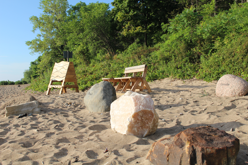
On a secluded beach at the end of Ravine Drive in Highland Park now sits a rock garden that has (I hope) a little bit of mystery and magic in it.

BenchHarpRocks-01

Ravine Drive is a winding road, secluded, lush with old trees and elegant houses. A small parking lot laid at the end marks the entrance to Millard Park and Ravine Drive Beach.

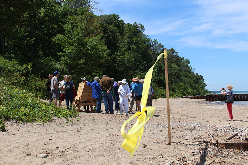
The beach has undergone a significant transformation over the past year. An old building was torn down, its foundation ripped out of the sand. Native foliage was replanted. And a lifelong resident of Highland Park’s curiosity and fascination with the stones that wash up on shore was brought to life.

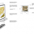
I had the great pleasure to meet with Marjie Ettinger, her husband Dick, and Rebecca Grill, Natural Areas Manager for The Park District of Highland Park over a year ago about this project. Marjie was interested in producing some kind of lasting installation about the multitude of rocks there. I was there to give it some shape: this is the early plan.

The initial Concept

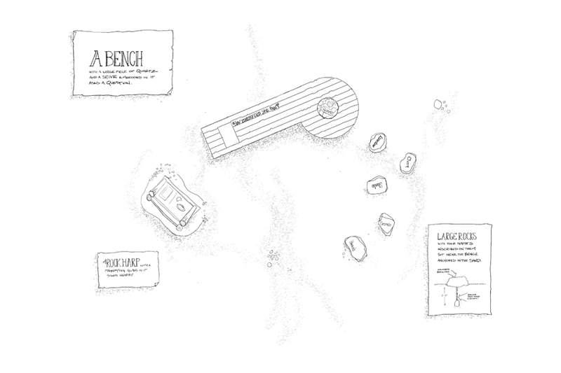
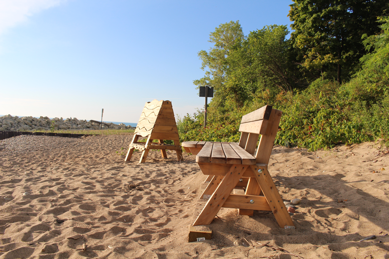
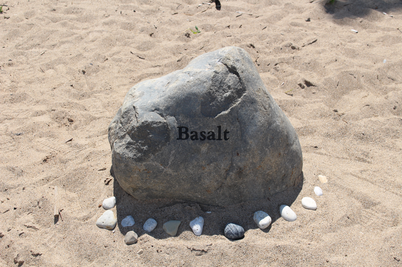
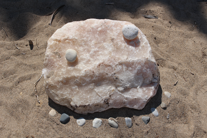
“The initial concept: a bench, a pebble harp, and a garden of giant beach stones, boulder-sized, with their names inscribed in them.”

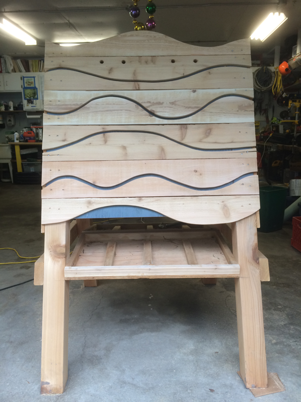
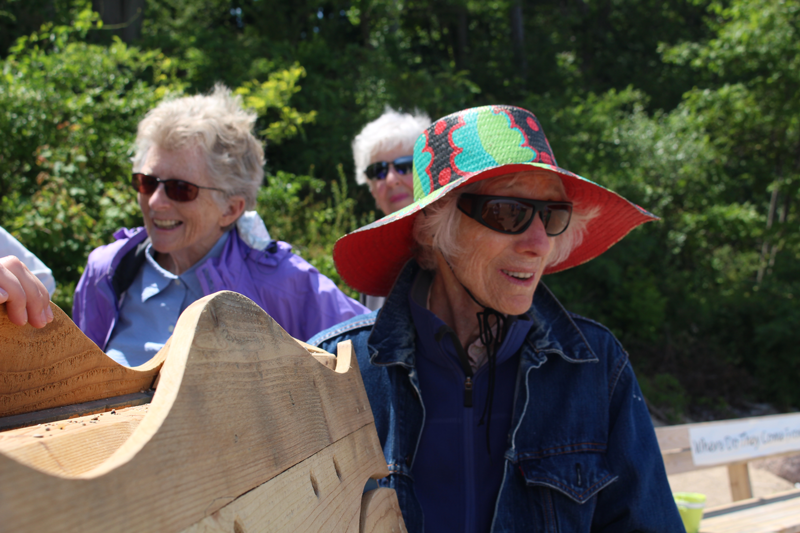
It’s not every day one gets the opportunity to create art for a public venue, or get the help and support one needs to actually make it happen. I am extremely grateful to say that Marjie and Rebecca both fell in love with the idea and ran with it. The indefatigable Ms. Grill turned her considerable energies to making sure this idea came to fruition, recruiting geologist Charles Shabica to assist in picking out the five types of stones that would be set in the beach, and Eagle Scout candidate Duncan Holzhall (who brought a whole cadre of Boy Scouts along with him) to build the bench and the pebble harp.

An Early Pebble Harp Sketch

Put the pebbles in the holes at the top and listen to them travel to the bin below.  It's good music.

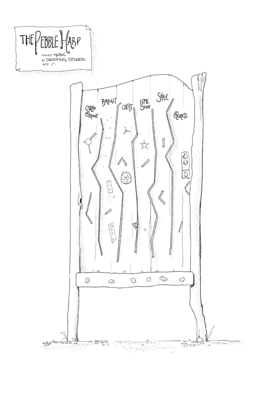
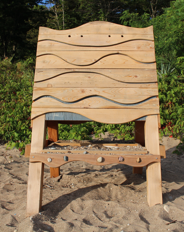
Put the pebbles in the holes at the top and listen to them travel to the bin below. It’s good music.

Granite

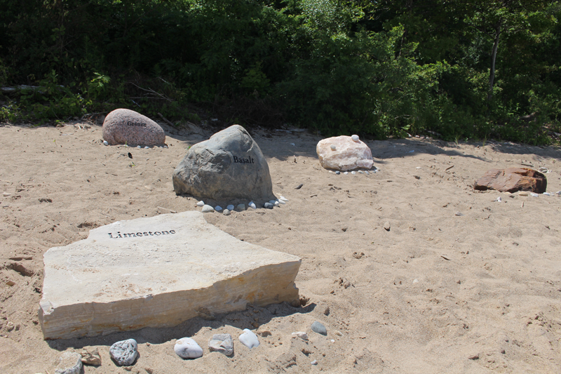
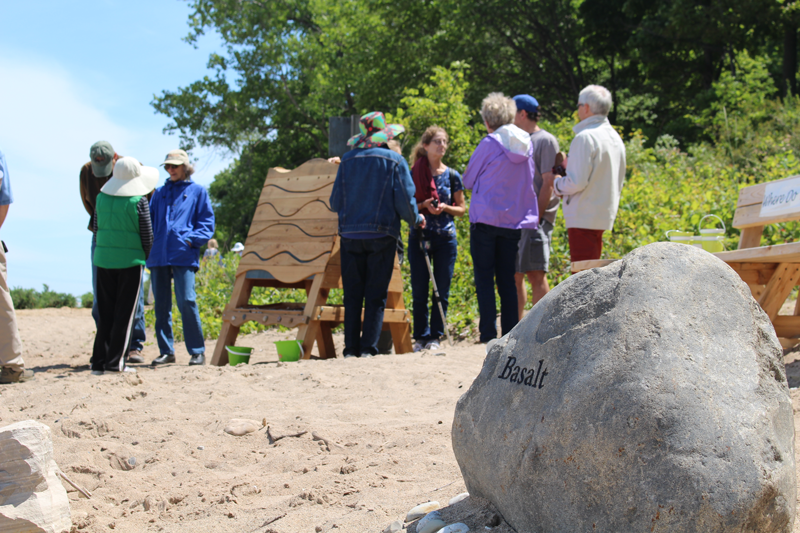
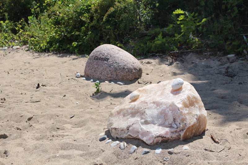
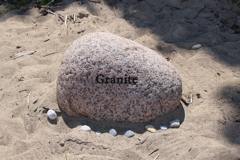
The rocks were bought, and had their names carved into them, by the good folks at Schwake Stone, Brick, and Fireplace Company.

BasaltQuartz

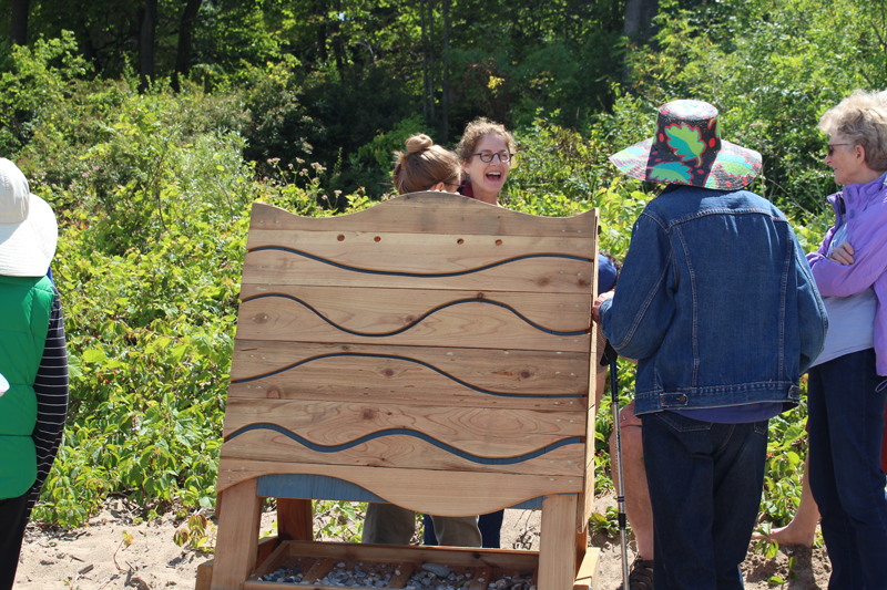
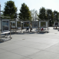
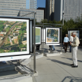
Already here in these photos you can see that the installation is working its magic; people engage with the garden, embellishing it with their own particular touches.

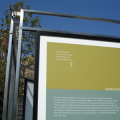
One of the significant motivating ideas throughout this project was to leave an opening for curiosity and wonder. In this day and age, when most of us carry the internet around in our pocket, it felt significant to not over-explain what is going on here at the beach. The rocks are simply identified, without any further explanation; the bench and pebble harp merely add anchors and further opportunity to engage with the area, also without explanation. Anyone can look up the names of these rocks on their phone and be connected to a wealth of information about them–far more than we could ever print on museum-esque panels mounted on poles on the beach. But is the beach really the place one wants to be standing and reading about rocks, geology, glaciers and currents and tides that move these rocks around? Or is it a place for play, for wonder, for exploration?

My contention is that one should leave the reading and academic information for where it can be absorbed best: at home, looking at a computer screen or the pages of a book. While at the beach – let’s play.

I hope you get to take a visit up to the end of Ravine Drive and explore the newfound serenity and natural peace found there. It’s a beautiful area, and I’m proud to have helped bring its new vibe into the world.

Another Version of The Resumé

I had occasion to assemble another version of my resumé today.  This one plays up some marketing/advertising campaign work and lightens up on the exhibition work.  I also included some live links in the PDF to some of the things I’ve written – for Production Plus’ eZine Solutions By Design, for instance.  I haven’t written anything for Pro Plus since we parted ways in 2008 or so, but there are some fun articles there in the archives, like this one where I get a quote from Smokin’ Joe Frazier) and my theater reviews for Centerstage.com.

I really enjoy the process of putting together a fresh resumé.  It gives me a chance to revisit old work, re-evaluate it, think about what I learned from it, and how I can apply that to my work today.  Take a look at this one if you’d like.  If you have any comments or suggestions, please send them my way!  I welcome sound opinions and dialogue on anything I’ve designed.

JD-resume-Apr2013


Revealing Chicago: Millennium Park 2005

Millennium Park was just a gleam in Mayor Daley’s eye when Terry Evans asked me if I wanted to work on a photo exhibition with her – the first one in the new park.  I worked closely with Ms. Evans while she was photographing inside The Field Museum for the exhibition From Prairie to Field. ((As you might have seen from the link to the Field Museum’s page, the exhibition was remounted in 2008.  The original was designed in 2001; I have some fine photographs from that original installation that will make it to this site eventually.))  I couldn’t have been more excited; I believe I accepted the job on the spot, without hesitation.

revealingchicago001

The exhibition was spearheaded by the indefatigable Jerry Adelman of Openlands, with cooperation and participation by Metropolis Strategies (then operating as Metropolis 2020).  The goal: to show the residents of Chicago their land–what it looks like from overhead, what it’s being used for, and how the growth of the city changes the landscape around us.

The exhibition opened in June of 2005 with the concrete still drying on the Gehry Bandshell.  I’m very proud to have worked on it.  It was a pleasure and a privilege to help bring Terry’s stunning photographs to an audience who could appreciate them as art and also be able to say, “hey, there’s my house!” or, “I drive past that every morning and had no idea it looked like that.”  To talk about the growth and progress of Chicago with its denizens and visitors in such a highly visible public space felt then – and still feels now – like one of the most valuable things I can do with the opportunities I’ve been given.

Revealing Chicago taught me more than I can relate here about the past, present, and future of the city.  Being on the periphery of Hizzoner’s great public work taught me a lot about the inner workings of Chicago government – which, as you may know, has always been a lively battleground.  At the opening of the exhibition I got to have a brief conversation with the Mayor:

 Hizzoner: Hey, nice show you got here.

JD: Thanks, Mayor!  Nice park you got here!

Hizzoner: Hey, thanks!

The rest of the conversation is one for the record books.  In order to appreciate it fully, some setup (and knowledge of certain maneuvers involving a former airport) is required – but if you wanna hear it and you run into me sometime I’ll be glad to tell it.

Do yourself a favor: take a look at Terry’s gallery of images from the show.  And (if you’re really interested) pick up the exhibition catalog.  I’m sure whether you are a Chicago native or just interested in some amazing photos, you’ll find something intriguing and beautiful.

Chicago Cutlery – Update.

Read the original knives post here.

I reached for a knife today to cut a tomato and came away from the block with the 62S.  It’s not the sharpest knife in the drawer.

Chicago Cutlery 62S

It’s been pretty dull since it got here.

I’ve had trouble sharpening it, but I thought I’d give it one more shot today and see what happened.  Out came the whetstone; dutifully I set to grinding, then tried it on the tomato.

No change.  WTF?  I go back to grinding, pissed off a little, and I stop.  I feel the edge: dull.  Then I take one careful, slow swipe across the stone.

Zing! The edge is sharp!  Check out the 62S, cutting tomatoes LIKE A BOSS.

The 62S cutting tomatoes

Slowing down and paying attention FTW.

I learned something valuable today!  Turns out I had been grinding the blade away endlessly and not really noticing what I was doing.  One slow grind across the whetstone is all a good knife needs to get sharp.

Cleopatra: Field Museum, 2001

I first learned of the exhibition that was to become Cleopatra: from History to Myth in a meeting at the Field Museum with a representative from the diver Franck Goddio.  He showed our team some photos taken in the harbor of Alexandria.

Historians had long known that there was much of ancient Alexandria that was under the waters of the modern day harbor, but until 1992 all access to the ruins was blocked by the Egyptian military.  Goddio and his team were the first modern-day surveyors of the submerged royal quarters of the Ptolemies–the last dynasty of pharaohs to rule Egypt.  What they found there shed a tremendous amount of light on the Ptolemaic Dynasty’s most famous daughter: Cleopatra VII.

Here are some of the photos from the exhibition at the Field Museum.  The artifacts were first shown in the Palazzo Ruspoli and hosted by the Fondazione Memmo; from there, they traveled to the British Museum and the workplace of the head curator for the exhibition, Susan Walker.  Ours was the final stop; we devoted almost 10,000 square feet to the display of over 130 artifacts.

The exhibition was a huge success.  The team working on it (graphic designer Dirk Urban, content developer Barbara Ceiga, projection and multimedia specialist Steve Villano, production supervisor Nel Featherling, project manager David Foster) was one of the finest I’ve ever had the pleasure to work with.

Megacosm

A Brett Neveu world premiere at Chicago’s A Red Orchid Theatre.  This was an amazing show.  From start to finish, all the artists involved pursued the making of this world with all their might.  The results were spectacular–due in no small part to the indefatigable spirit of director Dado Gyure.  She gave the show the engine it needed.

Enjoy the photos.  It was a great joy to make this one; no shop, no crew, just our hand tools, the theater, and Walter Briggs.  Thanks, man!

This show opened some time within a very cold January 2012, sold out nearly every show, and saw a nice extension.  Hedy Weiss reviewed it favorably and fairly, and Chris Jones of the Chicago Tribune was ebullient.

And away we go.

Begin anywhere. – John Cage

Hello, Internet users!  John Dalton here.  I’m a designer – mostly of museum exhibitions.  I’ve been designing things for 20 years solid.

Like many who pursue labors of love I’ve had to support myself while so doing, and in my early days compiled what one might describe as a stunning menagerie of jobs.  I’ve designed packaging to deliberately look cheap.  I’ve painted an 8′ x 8′ theatrical drop in a 6′ x 6′ room.  I once had an employer demand I print a slew of large-scale digital images out of a giant photographic printer that was not assembled yet. “We’ve got jobs due out of that thing,” he said, tight lipped and pointing at the printer and the team of German technicians congregated to assemble it.  “Get to work.”

I’ve hung EarthBall™ sized Christmas decorations from the ceiling of the Woodfield Mall with Bill Cusack. True story.

Slowly – over time, and amidst setbacks- this thundering herd of weird gained some shape.  Cool projects began to emerge from it; museum exhibitions, photo galleries, plays, movies, graphics, art installations, marketing campaigns, retail design.

This evolution continues. I’ve begun doing theatrical reviews, of all things. I’m developing an understanding of creative direction, and finding opportunities to step into that role.  Hopefully you get the idea. It’s been an eclectic, meandering evolution, catch-as-catch-can at times.

I’ve found it challenging to encapsulate all this in one website.  It’s a task I’ve long been dreading. Predictably, I’ve always wanted my website to be tremendously cool. As a longtime aficionado of teh internets, I have seen many a cool website. It’s daunting.  Call yourself a designer on the internet and immediately you’re in direct competition with Saatchi & Saatchi.  My last website was built in Dreamweaver, circa 2002; my internet manipulation skills were lackluster even then.

But I do consider myself to be a thoughtful designer, and over time I’ve developed a little toolkit of ideas to help me through thorny spots like this.  And I recalled something I read in Bruce Mau’s  Incomplete Manifesto For Growth; the quote from John Cage at the top of this missive: begin anywhere.

Cage’s continues (quote helpfully provided by Mr. Mau), saying that “…not knowing where to begin is a common form of paralysis.”  Most accurate.  I’ve not known how to begin this insurmountable task and it’s kept me paralyzed.

On the recommendation of John Cage and the urging of Bruce Mau, I’m starting now.  I will slowly build this thing.  Get my hands dirty and learn from the process, without really knowing what to expect.  I look forward to learning, and I’ll share my findings; optimally you’ll see the results here.  In addition, I’ll be posting portfolio pieces, observations, essays – whatever seems to be applicable to this labor of love, my career.

Serendipitously, Bruce Mau has chosen this maxim as his principal image for his manifesto page. It’s nice when things like that come together, ain’t it?  It seems an obvious sign.  Many thanks to Mr. Mau for his inspiration and example.

Begin Anywhere

Sometimes clues are in very obvious places.  I’ve learned a lot from his work, and I hope someday to meet him.

This is my website. There are many like it, but this one is mine.  Thanks for tuning in – or retuning, if you caught my last spate of blogging.  I hope to repost those here someday soon.  Mostly, though, I’m looking forward to where this leads. Please feel free to chime in, if you’d like. And welcome aboard.

The Elusive Brand Experience and How to Get It

I love this ad campaign. A simple idea, well executed. I ask a deceptively simple question: why is it so good?

Dentyne's Make Face Time Campaign, by McCann Worldwide

Dentyne’s Make Face Time Campaign, by McCann Worldwide

Designers are key players in the world of advertising. It’s where many of us make all our money. The giants of our field all won major battles in that arena: Paul Rand, Saul Bass, Tibor Kalman, to name a few. Though I would not presume to place myself in such august company, I have worked for commercial firms and wrestled with advertising work, branding, and experience design in a corporate setting. I’d love to say that I could come up with something as good as McCann’s “Face Time” campaign. But how would I do it?

My design approach is, traditionally, to let the content speak for itself. If I understand the material, then communicating it to an audience through whatever medium I’m working in becomes almost a transparent process; the job sometimes feels like it’s flowing out of me. But frequently in the corporate advertising world, there is no content, in the traditional sense. There is no script, as in theater or film; there are no curators, filling volumes with text about artifacts or ideas. There is only the product, and the company that makes it. Frequently, the folks from the company are looking to the design world to define and shape the substance of the experience. They understand who their target audience is, and all about their brand and product, but look to designers to craft the messages.

It’s not a step I’m accustomed to. I understand, at an elementary level, the message is that the product/service is the best and people should purchase it. But ads with copy like, “WE ARE AWESOME,” or “BUY OUR STUFF BECAUSE IT’S THE BEST EVER” really do not make it to the public eye anymore. Clients expect more from someone who claims to be a hotshot designer–and rightly so. Advertising is a competitive and subtle world; there are wonderful ad campaigns and brand experiences out there. I know them when I see them, and I admire the specificity of the message. So where does that message come from?

In my readings and research, I recently came across this quote.

The new medium of brand experience is now people, not television.
– David Dernie, In Exhibition Design

In one phrase, David Dernie both encapsulated and completed my unformed thoughts about what it means to, as the oft touted phrase goes, “build a brand experience.” For me, it goes beyond television, though it certainly applies. The thing I respond to in ad in any medium is how the people in them feel. The more specific the ad hones in on that feeling, the more effective it is.

Consider this commercial, long considered to be a watershed in the world of automobile advertising:

(For more about this ad, and the Nick Drake book that talks about it, see John’s comment below.)

The ad speaks volumes, and not just because of Nick Drake’s marvelous “Pink Moon.” The ad is incredibly specific about the product and the people who use it. The look the young man in the back seat gives the young woman as she silently watches the night sky fly by, wind in her hair; the flash of the backup light; almost iconic images. The viewer instantly understands what kind of party the young foursome is pulling up to–and why they choose to pull away. When viewed through the lens of Dernie’s statement, the reason for the ad’s success becomes obvious.

In this statement I find a key, also, to understanding why I get that feeling of the medium becoming transparent. When the story is strong, the tricks and skills needed to manipulate the medium fall away as the audience folds into the experience. Listening to Nick Drake for the first time, one rarely wonders what kind of tape it was recorded on, or what Drake’s tuning on the guitar is, or even how skillful a player he is; one listens to the song. Likewise with any good design experience; both for the viewer and the creator, the problems of the medium are all smoothed away. Television and film, in its best moments, no longer merely fascinate us with what they can do; skillful camera work, direction, scripting, combined with the audience’s comfort level with receiving information in that form, have made the television a frictionless conduit for story.

This touches on McLuhan’s signature axiom, of course, of the medium being the message – and might go a long way to refuting it. What happens to a medium when both public and designer are so familiar with it that its novelty, and all the tricks it can be made to do, has worn off? In the past decade, we have seen this happen. The internet used to be a place about itself; merely to have a website or be “be online” was enough of a statement. No longer; we are all so familiar with the medium that we can now push it out of the way and receive the messages.

So what makes an ad good? When approaching my next project, I will pull Dernie’s lens from my pocket and look through it for the people within it. They, after all, are the touchstone for understanding the brand experience. The closer I can get to communicating the emotions, the more specific I can be about them, the more successful the ad.

Balance and Harmony Without Symmetry

Those of you who have visited the Art Institute of Chicago may still have missed two of my most favorite experiences there. They are not easy to find. One is a gallery designed by the master architect Tadao Ando; the other is the model of the Japanese home in the Thorne Rooms (a stunning collection of scale models of interiors and rooms through history that are a must-see).

Japanese Enso

Japanese Enso

There is something about Japanese art that has always fascinated me; arrested me, in fact. There was a balance, a rightness about the structure that I could never put my finger on. This hearkens back to my earlier post about not understanding what makes good design but responding to it nonetheless; Japanese art and design has always provoked a response in me, but I was unable to say what element, or combination of elements, it was that drew it out of me.
I think I stumbled on it. Much of the idea has to do with the Japanese view of symmetry. You won’t find a lot of it in any aspect of Japanese design or art – at least, not in the sense that we know it. The quote below is the most succinct explanation of part of this phenomenon that I can find.

The dynamic nature of their philosophy laid more stress upon the process through which perfection was sought than upon perfection itself. True beauty could be discovered only by one who mentally completed the incomplete. The virility of life and art lay in its possibilities for growth. In the tea-room it is left for each guest in imagination to complete the total effect in relation to himself. Since Zen has become the prevailing mode of thought, the art of the extreme Orient has purposefully avoided the symmetrical as expressing not only completion, but repetition. Uniformity of design was considered fatal to the freshness of imagination.

– from The Book of Tea by Okakura Kakuzo, a reflection and presentation of Japanese culture to Western readers published in 1906. (emphasis mine)

Nature seems to abhor true symmetry. Very few things in nature can be folded upon themselves upon any axis and be said to be exactly the same – perhaps some snowflakes and other crystalline structures. But in general, left and right sides, up and down, back and front are not mirrors of one another at all. And, if they are, they do not look right. Consider the art of Mark Mothersbaugh – most famous as the founder and frontman of Devo.

Blox Bambina Daddys Rug, Mark Mothersbaugh 2007

Blox Bambina Daddy’s Rug, Mark Mothersbaugh 2007

I’ve read an article in the past where he talks about making these images. They are just photographs, split as evenly down the middle as possible and mirrored. These images completely skewer the idea that the human face is symmetrical – something the casual observer might assume to be true. One look is enough to relieve anyone of that notion.

Achieving true symmetry can be a great struggle. It is an easy way to achieve balance – but is it a cop-out? And can you ever really get there? There can, of course, be a Herculean effort to control all the variables in any design. But not everyone has the luxury of being able to create the Taj Mahal; and even then, do we really want to? Not to be reductive about it, but the bushes and trees that surround any structure, the page of a magazine, the existing room that an event is in … all sorts of things in the environment are going to foil true symmetry. Is it not then better to attain balance and harmony in some other way?

When tackling issues of balance, frequently I look to Japanese artists, architects, and designers for inspiration and solutions.

Taiso Yoshitoshi (1839-1892), iKintaro Riding the Giant Carp/i, color woodcut, 1882

Taiso Yoshitoshi (1839-1892), <i>Kintaro Riding the Giant Carp</i>, color woodcut, 1882

As always, your thoughts and comments are welcomed.