Last year I had the great pleasure to work with Mucca Pazza and Daniele Wilmouth, the director of the band’s remarkable short film, Fanfare For Marching Band.
Fanfare For Marching Band: Mucca Pazza at their finest.
Reply
Last year I had the great pleasure to work with Mucca Pazza and Daniele Wilmouth, the director of the band’s remarkable short film, Fanfare For Marching Band.
From time to time, I put together custom sample books for specific clients or prospects. My work ranges from theater to graphics; not all my clients are interested in seeing the sets I’ve built or the business cards I’ve designed.
Here’s a short set of some branding and marketing jobs that I’ve worked on, from big to small.
Like many graphic designers, I really enjoy learning about fonts and typefaces. I frequently lose myself looking up typefaces on the web, whether for a project or out of personal curiosity. Typefaces, for me, are evocative of … particular times, places, events, objects, any combination these at once. I find choice of typeface to be meaningful, so much so that I cannot help but be particular about a certain capital B and how perfect it is for the project I’m working on, and so forth.
A project I’ve been tossing about lately has been aching for the certain panache a solid font from post-WWII 1940’s and 50’s gives: a Futura of some kind, or Alternate Gothic, even.

Ain’t it great looking? Thanks to the folks at The League of Moveable Type blog for this image and their hip blogpost on Revival Typefaces.
Great fonts, no doubt, but not quite grabbing the look I wanted.
So I started to look around for references for what authentic 50’s typefaces were–for things like roadsigns; headlines in the New York Daily News, or the Post; dire warnings of atomic doom like fallout shelter signs, and the like. And I found a few great things that really helped sum up what I was looking for, and I thought I’d record it here so I would know how to find my way back to it. And, perhaps, other people will find these links useful as well.
The first item of note is this quote from Mark Simonson in a blog called Typophile, way back in 2005: “… Venus (especially Venus Extended), News Gothic/Trade Gothic, Alternate Gothic, Century Schoolbook, Century Expanded, Baskerville, Caslon 540, Stymie, Futura Display, Bauer Topic, Onyx, Brush Script, Latin, Playbill, Balloon, Flash Script…”
Some, of course, I was very familiar with, but I had never even heard of a font named Bauer Topic before! Or Venus! I’ll never miss an opportunity to learn about a seminal 50’s typeface; off into the internet I went, and came back the richer for it.
After I returned from that excursion, I read further down the Typophile blog conversation and found this entry, from Norbert Florendo, which I’ll quote at length:
… If we were to divide “American advertising” of the mid-nineteen-fifties, you would have high design style such as Bradbury Thompson, a huge mid-range and off course, (sic) schlock.
Handlettering was prevalent in use before the 50s because offset photo-lithography became the common and inexpensive means of printing and therefore affordable to most advertisers. By 1955, New York City became the mecca of lettering artists with an estimated 300 professionals employed. (Please read Peter Bain’s great article on phototype.)
Photolettering, Inc. (PLINC) in New York, was quickly building one of the largest libraries of phototype, with a stable of fledgling and veteran lettering artist such as Vinny Pacella, Vic Caruso and Ephram Benguiat.
Beautiful scripts and brush lettering abounded, and a popular treatment during the 50s was “Frisky” headlines (bouncing and rotated baselines).
Also, after Sputnik, the “Space Age” style became popular as well.
Believe it or not, Myfonts.com has a category of 1950s type suggestions.
I found all this to be a tremendously helpful starting point. I always find it useful in any project to know the history behind the typefaces I’m using, particularly if I’m going for a look and feel that hearkens back to a certain idea. Simply knowing that Helvetica wasn’t around until 1957–and what sans serif fonts preceded it–has informed all sorts of my choices when working with type in any setting. Mr. Florendo’s entry above is chock full of great starting points for all sorts of interesting learning about graphic design and typesetting from that era. My reasons for quoting it so completely above are somewhat selfish; I’ll be coming back to this to look up some of the names and references when I have the time.
Download the current PDF of my resumé from the link below. Please feel free to contact me for references, or samples, or questions. Thanks!
Life, it seems, is not going to slow down. Everyone that I know is, in fact, quite busy: engaged in raising their children, paying their bills, and trying to have a meaningful experience amidst all that. Many of my conversations with my friends begin with a long exchange about how wiped out we are from our respective schedules.
Yet most of us–myself included– consistently fret that we are not doing enough. The pace of our daily lives, and the demands on us, consistently ask for productivity. While it is valuable and feels good to be productive, it’s not the only element that goes into building sustainable, prosperous work. Sustainable, here, I think is the key; for, while we might be productive in the short term, we are not machines. Out tolerance for mere production is limited. Numerous studies, done by people far smarter than me, show that productivity over time for even the most focused individuals drops markedly after a certain point. One of the things that sustains work is learning.
I love to learn. Optimally, I would like to constantly be learning, to continually be curious and allow my curiosity to guide me. All sorts of things make me curious: the complexities of a microchip; how many species of animal might live in one single hollow log at the same time; life on another planet.
One of the reasons I love what I do is that I constantly get to work on new things, learn new ideas, and come up with ways to ignite the same kind of curiosity and excitement I feel about them to others. That’s a reward of good design; the emotional intent of the person with the message gets translated to the audience.
Learning, however, takes time. And patience; and a certain freedom to surrender to the process and make some mistakes. That’s a difficult thing to reconcile, sometimes, when we’re constantly expected to produce, or be on a schedule.
I don’t propose to have the answer to where that balance is; more than likely, it changes all the time depending on the circumstances. One thing is clear, though: good work, revolutionary ideas, and wonderful results come from learning, and play, and experimentation. So I resolve to continually renew my student ID; try on new hats; fail. Fail spectacularly, even. If I’m doing it right, watching me crash to the ground will be hilarious – for all involved. And I do enjoy a good laugh.
Speaking of which: it’s time for this website to go live!
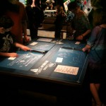
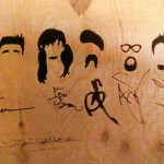
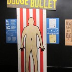
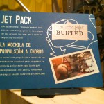
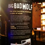
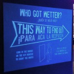
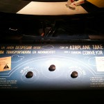
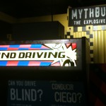
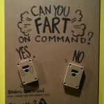
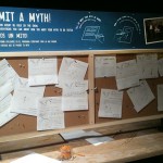
I had the great fortune to work on the team that developed, designed, and made Mythbusters: The Explosive Exhibition. Here are a few shots of my graphics from the debut at the Museum of Science and Industry in Chicago!
Begin anywhere. – John Cage
Hello, Internet users! John Dalton here. I’m a designer – mostly of museum exhibitions. I’ve been designing things for 20 years solid.
Like many who pursue labors of love I’ve had to support myself while so doing, and in my early days compiled what one might describe as a stunning menagerie of jobs. I’ve designed packaging to deliberately look cheap. I’ve painted an 8′ x 8′ theatrical drop in a 6′ x 6′ room. I once had an employer demand I print a slew of large-scale digital images out of a giant photographic printer that was not assembled yet. “We’ve got jobs due out of that thing,” he said, tight lipped and pointing at the printer and the team of German technicians congregated to assemble it. “Get to work.”
I’ve hung EarthBall™ sized Christmas decorations from the ceiling of the Woodfield Mall with Bill Cusack. True story.
Slowly – over time, and amidst setbacks- this thundering herd of weird gained some shape. Cool projects began to emerge from it; museum exhibitions, photo galleries, plays, movies, graphics, art installations, marketing campaigns, retail design.
This evolution continues. I’ve begun doing theatrical reviews, of all things. I’m developing an understanding of creative direction, and finding opportunities to step into that role. Hopefully you get the idea. It’s been an eclectic, meandering evolution, catch-as-catch-can at times.
I’ve found it challenging to encapsulate all this in one website. It’s a task I’ve long been dreading. Predictably, I’ve always wanted my website to be tremendously cool. As a longtime aficionado of teh internets, I have seen many a cool website. It’s daunting. Call yourself a designer on the internet and immediately you’re in direct competition with Saatchi & Saatchi. My last website was built in Dreamweaver, circa 2002; my internet manipulation skills were lackluster even then.
But I do consider myself to be a thoughtful designer, and over time I’ve developed a little toolkit of ideas to help me through thorny spots like this. And I recalled something I read in Bruce Mau’s Incomplete Manifesto For Growth; the quote from John Cage at the top of this missive: begin anywhere.
Cage’s continues (quote helpfully provided by Mr. Mau), saying that “…not knowing where to begin is a common form of paralysis.” Most accurate. I’ve not known how to begin this insurmountable task and it’s kept me paralyzed.
On the recommendation of John Cage and the urging of Bruce Mau, I’m starting now. I will slowly build this thing. Get my hands dirty and learn from the process, without really knowing what to expect. I look forward to learning, and I’ll share my findings; optimally you’ll see the results here. In addition, I’ll be posting portfolio pieces, observations, essays – whatever seems to be applicable to this labor of love, my career.
Serendipitously, Bruce Mau has chosen this maxim as his principal image for his manifesto page. It’s nice when things like that come together, ain’t it? It seems an obvious sign. Many thanks to Mr. Mau for his inspiration and example.

Sometimes clues are in very obvious places. I’ve learned a lot from his work, and I hope someday to meet him.
This is my website. There are many like it, but this one is mine. Thanks for tuning in – or retuning, if you caught my last spate of blogging. I hope to repost those here someday soon. Mostly, though, I’m looking forward to where this leads. Please feel free to chime in, if you’d like. And welcome aboard.
I love this ad campaign. A simple idea, well executed. I ask a deceptively simple question: why is it so good?

Dentyne’s Make Face Time Campaign, by McCann Worldwide
Designers are key players in the world of advertising. It’s where many of us make all our money. The giants of our field all won major battles in that arena: Paul Rand, Saul Bass, Tibor Kalman, to name a few. Though I would not presume to place myself in such august company, I have worked for commercial firms and wrestled with advertising work, branding, and experience design in a corporate setting. I’d love to say that I could come up with something as good as McCann’s “Face Time” campaign. But how would I do it?
My design approach is, traditionally, to let the content speak for itself. If I understand the material, then communicating it to an audience through whatever medium I’m working in becomes almost a transparent process; the job sometimes feels like it’s flowing out of me. But frequently in the corporate advertising world, there is no content, in the traditional sense. There is no script, as in theater or film; there are no curators, filling volumes with text about artifacts or ideas. There is only the product, and the company that makes it. Frequently, the folks from the company are looking to the design world to define and shape the substance of the experience. They understand who their target audience is, and all about their brand and product, but look to designers to craft the messages.
It’s not a step I’m accustomed to. I understand, at an elementary level, the message is that the product/service is the best and people should purchase it. But ads with copy like, “WE ARE AWESOME,” or “BUY OUR STUFF BECAUSE IT’S THE BEST EVER” really do not make it to the public eye anymore. Clients expect more from someone who claims to be a hotshot designer–and rightly so. Advertising is a competitive and subtle world; there are wonderful ad campaigns and brand experiences out there. I know them when I see them, and I admire the specificity of the message. So where does that message come from?
In my readings and research, I recently came across this quote.
The new medium of brand experience is now people, not television.
– David Dernie, In Exhibition Design
In one phrase, David Dernie both encapsulated and completed my unformed thoughts about what it means to, as the oft touted phrase goes, “build a brand experience.” For me, it goes beyond television, though it certainly applies. The thing I respond to in ad in any medium is how the people in them feel. The more specific the ad hones in on that feeling, the more effective it is.
Consider this commercial, long considered to be a watershed in the world of automobile advertising:
The ad speaks volumes, and not just because of Nick Drake’s marvelous “Pink Moon.” The ad is incredibly specific about the product and the people who use it. The look the young man in the back seat gives the young woman as she silently watches the night sky fly by, wind in her hair; the flash of the backup light; almost iconic images. The viewer instantly understands what kind of party the young foursome is pulling up to–and why they choose to pull away. When viewed through the lens of Dernie’s statement, the reason for the ad’s success becomes obvious.
In this statement I find a key, also, to understanding why I get that feeling of the medium becoming transparent. When the story is strong, the tricks and skills needed to manipulate the medium fall away as the audience folds into the experience. Listening to Nick Drake for the first time, one rarely wonders what kind of tape it was recorded on, or what Drake’s tuning on the guitar is, or even how skillful a player he is; one listens to the song. Likewise with any good design experience; both for the viewer and the creator, the problems of the medium are all smoothed away. Television and film, in its best moments, no longer merely fascinate us with what they can do; skillful camera work, direction, scripting, combined with the audience’s comfort level with receiving information in that form, have made the television a frictionless conduit for story.
This touches on McLuhan’s signature axiom, of course, of the medium being the message – and might go a long way to refuting it. What happens to a medium when both public and designer are so familiar with it that its novelty, and all the tricks it can be made to do, has worn off? In the past decade, we have seen this happen. The internet used to be a place about itself; merely to have a website or be “be online” was enough of a statement. No longer; we are all so familiar with the medium that we can now push it out of the way and receive the messages.
So what makes an ad good? When approaching my next project, I will pull Dernie’s lens from my pocket and look through it for the people within it. They, after all, are the touchstone for understanding the brand experience. The closer I can get to communicating the emotions, the more specific I can be about them, the more successful the ad.
The purpose of practice is not the mastery of the discipline but the route itself, which leads toward the achievement of self-perfection and increasing harmony with others and things.
– Louis Frederic, in A Dictionary of the Martial Arts
It is no great secret that our economy is results driven. Mistakes are not looked upon favorably. Going back to the drawing board is rarely seen as a good thing. There is a saying I’ve heard bandied about: “Done is better than good.” Usually this is brought up when something is very close to blowing through the gates of some do-or-die deadline; but sometimes it is invoked in order to simply relieve the speaker of taking apart whatever it is he or she has been working on and calling it done.
But it is in the doing, the creating, the making of mistakes that sometimes true genius is stumbled upon. In his Incomplete Manifesto for Growth, Bruce Mau says “Make mistakes faster.” There is something to that.
Oftentimes when a project is stuck, or looking drab, or mired in some weird creative morass, I like to just start working on something in it – even if I know whatever I’m working sucks rocks. Frequently, just the process of working dislodges me from the mire; suddenly, I see the piece in a whole different light and ideas are flowing again.
This leads me to wonder, again, about the artistic process in design. Though it is the nature of business to complete things, I wonder if a piece can ever be considered truly done.Artists return to their eariler works frequently, revising, reinventing, allowing the work to evolve, building on their experiences and reacting to the changing environment.

Andy Goldsworthy, Japanese Maple

Andy Goldsworthy, Knotweed Stalks

Andy Goldsworthy, Rowan Leaves Around a Hole
Looking at Andy Goldsworthy’s work calls to mind this idea – not only in the way he will repeat a theme in a different location and medium but in the way that his work is impermanent. Many of the pieces he produces, including the three above, are meant to literally blow away, be dissolved back into the environment.
It strikes me that a perfect example of this kind of iteration, change, and constant work is clearly evident in the work of a web designer. Any given company’s URL is constantly changing; the “title” of the work, as it were, remains the same, but the look, feel, shape, size, and content of it is always changing, constantly being revised and revisited, never done – only done for now. To see this in action, visit this utterly fascinating site: The Internet Archive. 85 billion web pages, archived. Take a look at the Wayback Machine and choose any company; for the purposes of this exercise, I chose United Airlines. Many of the image links are broken, but the point of the exercise holds; the site is constantly changing, being worked on, evolving. So, when can one say that it is ever really done?
I feel that sometimes our work, being so “completion” driven, for lack of a better word, can remove us from the sense of ourselves as artistic entities. If one moves from job to job to job, constantly reacting to the next set of constraints without a sense of one’s own input into the process, it’s easy to lose any sense of evolution or continuity. I encourage myself and us all to find that thread of thought and cultivate it. Build a sense of your own evolution; carry it forward into each project, and add to what you’ve done before. Do it again, do it again, do it again. It will never be the same way twice.
Those of you who have visited the Art Institute of Chicago may still have missed two of my most favorite experiences there. They are not easy to find. One is a gallery designed by the master architect Tadao Ando; the other is the model of the Japanese home in the Thorne Rooms (a stunning collection of scale models of interiors and rooms through history that are a must-see).

Japanese Enso
There is something about Japanese art that has always fascinated me; arrested me, in fact. There was a balance, a rightness about the structure that I could never put my finger on. This hearkens back to my earlier post about not understanding what makes good design but responding to it nonetheless; Japanese art and design has always provoked a response in me, but I was unable to say what element, or combination of elements, it was that drew it out of me.
I think I stumbled on it. Much of the idea has to do with the Japanese view of symmetry. You won’t find a lot of it in any aspect of Japanese design or art – at least, not in the sense that we know it. The quote below is the most succinct explanation of part of this phenomenon that I can find.
The dynamic nature of their philosophy laid more stress upon the process through which perfection was sought than upon perfection itself. True beauty could be discovered only by one who mentally completed the incomplete. The virility of life and art lay in its possibilities for growth. In the tea-room it is left for each guest in imagination to complete the total effect in relation to himself. Since Zen has become the prevailing mode of thought, the art of the extreme Orient has purposefully avoided the symmetrical as expressing not only completion, but repetition. Uniformity of design was considered fatal to the freshness of imagination.
– from The Book of Tea by Okakura Kakuzo, a reflection and presentation of Japanese culture to Western readers published in 1906. (emphasis mine)
Nature seems to abhor true symmetry. Very few things in nature can be folded upon themselves upon any axis and be said to be exactly the same – perhaps some snowflakes and other crystalline structures. But in general, left and right sides, up and down, back and front are not mirrors of one another at all. And, if they are, they do not look right. Consider the art of Mark Mothersbaugh – most famous as the founder and frontman of Devo.

Blox Bambina Daddy’s Rug, Mark Mothersbaugh 2007
I’ve read an article in the past where he talks about making these images. They are just photographs, split as evenly down the middle as possible and mirrored. These images completely skewer the idea that the human face is symmetrical – something the casual observer might assume to be true. One look is enough to relieve anyone of that notion.
Achieving true symmetry can be a great struggle. It is an easy way to achieve balance – but is it a cop-out? And can you ever really get there? There can, of course, be a Herculean effort to control all the variables in any design. But not everyone has the luxury of being able to create the Taj Mahal; and even then, do we really want to? Not to be reductive about it, but the bushes and trees that surround any structure, the page of a magazine, the existing room that an event is in … all sorts of things in the environment are going to foil true symmetry. Is it not then better to attain balance and harmony in some other way?
When tackling issues of balance, frequently I look to Japanese artists, architects, and designers for inspiration and solutions.

Taiso Yoshitoshi (1839-1892), <i>Kintaro Riding the Giant Carp</i>, color woodcut, 1882
As always, your thoughts and comments are welcomed.