Like many graphic designers, I really enjoy learning about fonts and typefaces. I frequently lose myself looking up typefaces on the web, whether for a project or out of personal curiosity. Typefaces, for me, are evocative of … particular times, places, events, objects, any combination these at once. I find choice of typeface to be meaningful, so much so that I cannot help but be particular about a certain capital B and how perfect it is for the project I’m working on, and so forth.
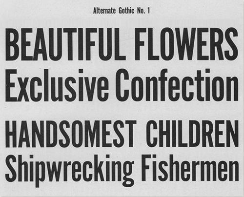
A project I’ve been tossing about lately has been aching for the certain panache a solid font from post-WWII 1940’s and 50’s gives: a Futura of some kind, or Alternate Gothic, even.

Ain’t it great looking? Thanks to the folks at The League of Moveable Type blog for this image and their hip blogpost on Revival Typefaces.
Great fonts, no doubt, but not quite grabbing the look I wanted.
So I started to look around for references for what authentic 50’s typefaces were–for things like roadsigns; headlines in the New York Daily News, or the Post; dire warnings of atomic doom like fallout shelter signs, and the like. And I found a few great things that really helped sum up what I was looking for, and I thought I’d record it here so I would know how to find my way back to it. And, perhaps, other people will find these links useful as well.
The first item of note is this quote from Mark Simonson in a blog called Typophile, way back in 2005: “… Venus (especially Venus Extended), News Gothic/Trade Gothic, Alternate Gothic, Century Schoolbook, Century Expanded, Baskerville, Caslon 540, Stymie, Futura Display, Bauer Topic, Onyx, Brush Script, Latin, Playbill, Balloon, Flash Script…”
Some, of course, I was very familiar with, but I had never even heard of a font named Bauer Topic before! Or Venus! I’ll never miss an opportunity to learn about a seminal 50’s typeface; off into the internet I went, and came back the richer for it.
After I returned from that excursion, I read further down the Typophile blog conversation and found this entry, from Norbert Florendo, which I’ll quote at length:
… If we were to divide “American advertising” of the mid-nineteen-fifties, you would have high design style such as Bradbury Thompson, a huge mid-range and off course, (sic) schlock.
Handlettering was prevalent in use before the 50s because offset photo-lithography became the common and inexpensive means of printing and therefore affordable to most advertisers. By 1955, New York City became the mecca of lettering artists with an estimated 300 professionals employed. (Please read Peter Bain’s great article on phototype.)
Photolettering, Inc. (PLINC) in New York, was quickly building one of the largest libraries of phototype, with a stable of fledgling and veteran lettering artist such as Vinny Pacella, Vic Caruso and Ephram Benguiat.
Beautiful scripts and brush lettering abounded, and a popular treatment during the 50s was “Frisky” headlines (bouncing and rotated baselines).
Also, after Sputnik, the “Space Age” style became popular as well.
Believe it or not, Myfonts.com has a category of 1950s type suggestions.
I found all this to be a tremendously helpful starting point. I always find it useful in any project to know the history behind the typefaces I’m using, particularly if I’m going for a look and feel that hearkens back to a certain idea. Simply knowing that Helvetica wasn’t around until 1957–and what sans serif fonts preceded it–has informed all sorts of my choices when working with type in any setting. Mr. Florendo’s entry above is chock full of great starting points for all sorts of interesting learning about graphic design and typesetting from that era. My reasons for quoting it so completely above are somewhat selfish; I’ll be coming back to this to look up some of the names and references when I have the time.


